When I started my career as an art director, I expected to apply everything I had learned in portfolio school to client work but never expected to one day rebrand my entire agency. In 2019, Curiosity, an independent creative shop in Cincinnati decided it was time for a brand refresh and, as a result, I got to work alongside a small team of art directors, designers and writers to bring a modern look to our really unique agency. It’s honestly one of my favorite projects I’ve ever worked on.
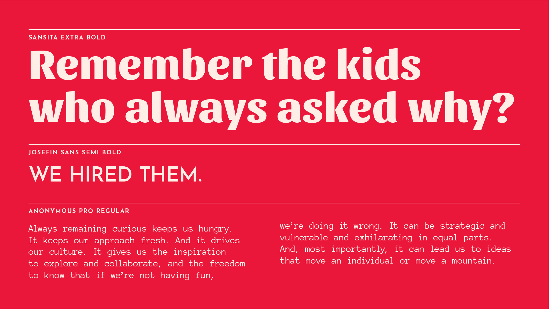
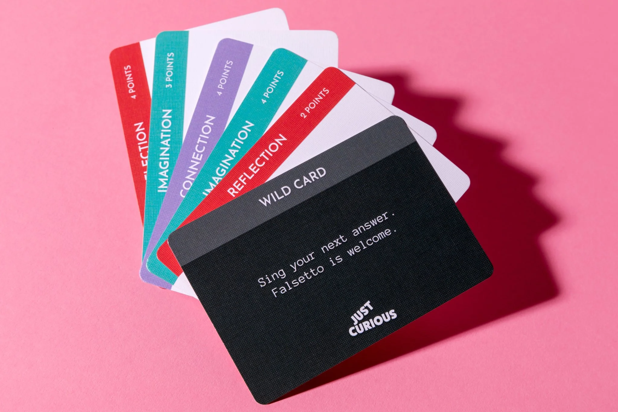
The outcome was a logo that represents our agency's philosophy of being courageously curious and creative. The flipped letters within the logo pique curiosity and act as kinetic elements that always change. The square holding shape provides structure and constraint but the elements inside are playful and inventive. The color palette is bold, passionate and stands out among many other agencies that default to neutral color palettes. Everything from the graphic system to employee photography showcases our willingness to stand out from the status quo and infuse fun into the creative process.